Tuesday, April 16, 2013

Adventures in Vegas: Not the Trip Most People Would Take

This past weekend, I drove the 385 miles south to Las Vegas.  The DH and I were desperately in need  of some R&R.  Having lived in Vegas briefly, we didn't take the "normal" Vegas vacation.  Rather, we revisited places we enjoyed while we lived there.  Both of us are fond of history and natural resources, so our trip revolved around checking out museums.  Aren't we just a couple of wild and crazy kids?  Anyway, I spotted a few things along the way that I thought were blog worthy.

I actually have to give props to the DH for spotting the first gems of the trip:


These two restroom signs were at the Mineral County courthouse in Hawthorne.  We stopped so the DH could pay a speeding ticket - ahem!  Anyway, I think the signs are darling.  


This motel sign was in Luning (or was it Mina?).  I love the little atomic stars. 

 For me, the one destination I was looking most forward to was the Clark County Museum in Henderson. 


Inside the museum with their regular exhibits, I found this little metal cabinet with pink and gold fleck laminate top.  In nice shape too!

The highlight of the Clark County Museum is an entire street of real houses saved from destruction in Las Vegas.  Each one is from a different decade of the 20th century and decorated accordingly.


This house was built by the U.S. Govt.  in 1941 for workers in the magnesium plant in Henderson.  When you go inside, it's obvious is was meant as temporary housing.  This one was occupied up until the 1980s, so much for being "temporary."


Here's the little kitchen.  By the way, I apologize for the quality of some of the photos, the rooms were closed off with plexiglass so it was tricky getting photos that didn't have reflections in them.  


This house was the coolest in terms of fun mid century features.  The house was built in the early 1930s but was redecorated in the 1940s-1950s.  A lot of what is in the house is original.


Two views of the living room when you first step into the house.  Sorry about the creepy mannequins.  I wish I'd gotten a closeup of the curtains, they're quite cool.


Views of the kitchen and dining room.  That linoleum is wonderful.  Also love the breakfast nook with the dinette.


The bathroom could be the piece de resistance though.  Check out the floor tiles and how they match the color and pattern of the wall tiles.  Also love the sink skirt.


This house is from Boulder City, dating to the 1930s when they were building Boulder Dam.


Views of the kitchen and bathroom with matching yellow and black tile.


Early "motor camp" cabin with fun "western" furniture.


Sunday, March 17, 2013

Kitchen Remodel: A Whole New Plan

Previously I went a little OCD on figuring out what pattern of VCT I wanted for my kitchen floors.  Well, despite a lot of time fooling around with patterns and colors, I've scrapped the whole plan and have decided to go with Marmoleum instead.  Last week, I order four samples of Marmoleum and I totally dig the look, color, and sustainability of the stuff.  Below are the four samples I ordered.

Herb Garden

Fresh Fountain

Spring Dance

Pool Party

Spring Dance and Pool Party are my two favorites.  They both match with the Nevamar countertop color I've picked, California:
In real life, California is a lot more yellow.  On my monitor it almost looks peachy but trust me, it's very yellow.


So for the past week, I've been staring at the Marmoleum samples and the various countertop samples I've ordered from Nevamar and Pionite and I think I have come with an honest to goodness plan for the kitchen.  I'll be going with Pool Party on the floor and California on the countertops.  As much as I love the colors in Spring Dance, I just don't think others will appreciate it's craziness.  I try not to think about resale value when I come up with my decorating schemes but I have a feeling Spring Dance on the floors would be a big turn off to a lot of people.  It doesn't really matter though because Pool Party looks fantastic up against my birch wood cupboards.


I was also inspired by a picture I saw on Retro Renovation that showed a kitchen with a fun argyle pattern on the soffits, which got me thinking about putting wallpaper on my own soffits.  After much searching for the wallpaper of my dreams - or at least something that would more-or-less match the floor and counter colors I've chosen - I decided that the best course of action would be to paint an argyle pattern in matching colors.  This is what I came up with using some graph paper and a ruler:


The aqua and yellow will be closely matched the floor and counters and I'll ad a bit of orange for the third color. The uncolored bits will be the same shade as the existing wall paint.  I've set myself up for a lot of taping and painting but I think the outcome will look awesome and fun.  I made a quick little mock up to see what the scale would look like on the soffit.  Pretty darn good, I think:


The pattern will be repeated the full length and height of the soffit, of course.

Here's everything overlaid on a picture of the kitchen:


Tuesday, February 19, 2013

What is "Authentic?"

I've been thinking a lot about what we mean by the word "authentic," especially in regard to "period correct" home decor.  It seems to me that those of us who strive to recreate a period do so with a considerable amount of biases dragging us down.  All one needs to do is flip through any magazine devoted to "period correct" decor to realize that we don't really want to live in authentic period homes.  We may like the look of historic houses and the idea of living with museum pieces but the reality is that we like our TVs, microwaves, comfy couches, counter space, and central heating.  We're also, every one of us, guilty of picking and choosing items based on personal appeal rather than on "authenticity."

All of this got started for me the other night when I had something of an epiphany while wrestling with a bout of insomnia.  I was thinking about how much I dislike mid century modern couches.  They're low with low backs and seem to be designed for perching rather than lounging.  I can imagine Jackie O perched gracefully on the front of a mid mod couch, ankles neatly crossed but I can't imagine myself nestled in for a day of TV watching.  They're angular and low with stiff cushioning - or so I imagine.   I DO like the look of mid mod couches and Danish modern decor in general but there's something off-putting about it.  Maybe because mid mod furniture looks too much like art pieces and not like something you could stick your feet on.  Or maybe it's because I didn't grow up with that kind of furniture in my life.

My grandparents (both sets) built their homes in the 1950s and by the time I came along in the early 1970s, the decor in their homes was circa 1965.  My Grandma Lee strove for a "Hollywood Regency" look.  Her home was filled with ornately carved upholstered furniture and "gilded" accessory pieces.  Rococo comes to mind.  She even had a fabulous white and gold bedroom set with a big headboard and matching vanity.  My Grandma Charity favored a bit more of what I'd  call "country contemporary casual."  She did own a mid mod couch  but for the most part, her house was La-Z-Boy recliners, hobnail lamps, and upholstered pieces with simple wooden arms.  My stepfather's parents decorated their home in a similar fashion.

So the epiphany that I had amounts to this - those of us seeking to decorate our mid century homes are too focused on the mid mod look.  I think the reality is that a lot (if not most) people in the 1950s-1960s did not have high end mid mod furniture.  This is purely anecdotal on my part as I am basing my opinion on the homes I knew as a kid but the fact remains that there were other ways people decorated their houses.  I suspect that the mid mod stuff is still around is because it was expensive and has achieved antique status whereas the millions of plaid couches and La-Z-Boy recliners went to the dump or the second hand store.

So, to put my money where my mouth is, I put together a mood board that shows some of the pieces I think would actually be authentic to a mid century modest house - or at least the homes I knew as a kid. And if I can find the right pieces, I'm going to bring them into my house.


I based my choices for what I call my "Comfy Living Room" on what I remember being in my family's homes from the 1970s.  Skirted plaid couches with wood accents, rocker recliners, tiered sidetables, and hurricane swag lamps. To tie the room together, I'd go with knotty pine paneling and a braided rug.  I'm especially enamored with the idea of finding a rocking loveseat, which both my mom and my Grandma Charity owned.  I'm very nostalgic about those sofas, they were so comfy and I loved that they rocked.  My dream would be to find a living room set that included the couch, loveseat, and rocker/recliner but I suspect the best I can hope for is to find decent pieces and have them reupholstered to match.  My living room already has the paneling and I am an experienced rug braider.  I plan to make a crazy, unmatched rug with some wool I've been saving.

So anyway, I recognize that this decor idea isn't everyone's cup of tea but I like it.  But I was never comfortable with bringing mid mod into my house so I think this is a great option and, at least for me, it's more "authentic" than a mid mod living room set.

Sunday, February 10, 2013

Tiki Paradise Guest Room Projects

I got very ambitious today and tackled two projects I've been wanting to do for the Tiki Paradise Guest Room.  The mirror in the room is one I got from Ikea several years ago.  It worked great with my decor in Seattle but it seems out of place in my 1962 mid century modest ranch.  Thankfully, I kept it because I was able to tiki-fy it for my guest room.  I'm quite proud of myself, so here's what I did.

I wanted to frame the mirror in bamboo to give it that tiki look.  So after much thought, I visited Home Depot and our local (and much loved!) Louie's Ace Hardware for the necessary components.  At Home Depot, I spent a whopping $6 on bamboo rods from the gardening center and at Louie's I spent another $8 for sheets of balsa wood.  I then assembled a few necessary tools from around the house - my glue gun, a tape measure, a box cutter, a Japanese saw, and masking tape.

Here is the victim before tiki-fication and some of the components and tools:


Step #1 - cut the balsa wood to fit over the scrolly bits on the mirror.  I decided to frame out the mirror in balsa for two reasons: 1) I knew there would be gaps between the bamboo rods and I figured the balsa would help mask that and 2) I also knew the bamboo would be difficult to stick straight to the scrolls, so the balsa would provide a platform for the bamboo.  

Step #2 - glue the balsa to the scrolls.  This was trickier than I thought it would be because the scrolls weren't perfectly level but with enough hot glue, I got it to work.  


Step #3 - get husband to cut the bamboo to the dimensions of the mirror.  Following recommendations on the internet, we taped the sections that were going to be cut to prevent splintering.  The Japanese saw worked great to cut the bamboo. 


Step #4 - glue bamboo rods to the balsa wood.  This was a bit harder than I thought it would be.  The bamboo wasn't perfectly straight so it took some patience and finesse to find pieces that worked together and didn't leave big gaps.  FYI for anyone who wants to attempt this, start by gluing the straightest pieces on the inside edge of the frame and then work out from there.  Here's the finished product:


A few of the scrolls still peak out here and there but I think it looks pretty good .  After finishing the mirror, I got even more ambitious and decided to make curtains using the green leaf print fabric that started the whole tiki idea.  I then rearranged the room so that my new bureau was under the mirror.  Currently, the Tiki Paradise Guest Room is more of a Tiki Paradise Corner but at least the project is moving forward.  Here's what it all looks like together:


Thursday, February 7, 2013

Tiki Paradise Guest Room

Since moving into my house 3 years ago, the smallest bedroom hasn't seen much action other than as a catch-all for stuff I don't know what to do with.  Occasionally, it's been used as a guest room but my guests have been forced to sleep on a blow up mattress among the household flotsam and jetsam.  It's not the most inviting space.

When I bought the house, the room had awful faux wood paneling on one wall.  It was plasticky and a sort of  greenish grey color.  It was icky and the second I got the keys to the house, I tore it out.  Unfortunately, it was glued to the drywall, so bits of the wall came off with the paneling and big ugly globs of yellow glue continue to mar the surface.  Initially, I had planned to replace the drywall and paint the wall an accent color, like a cheerful leafy green but I've decided to go with knotty pine instead.  I love the look of knotty pine and I think it will make my sad little guest room warm and inviting.  After deciding on knotty pine, a plan was beginning to form.

The plan really began to solidify after a recent trip to Mill End, a warehouse of a fabric store in Reno.  I was just browsing the aisles when I found an adorable cotton print that I thought would make a cute set of curtains.  The fabric is a leaf green with stylized geometric leaves in brown and blue.  Something about the fabric said "tiki" to me.  And then it hit me, I have to turn my guest room into a Tiki Paradise Guest Room.

Since my brainstorm, a couple of weeks ago, I've been dreaming about what to put in the room.  I'm going to try to avoid making it too kitschy and I'm determined to make it look tasteful.  Plus the room is actually quite small - about 10 x 12, so I can't get too carried away with decorations.  So currently the plan centers around a few key things - knotty pine paneling on one wall, curtains using my leafy fabric, a couple of pieces of mid century furniture I just bought at a second hand store, a couple of framed parrot prints, and a shag rug.  Ultimately I'd like to put a rattan chair in the room and a fun tiki/tropical inspired table lamp.  But for now, this is what I've come up with.  It's my first attempt at anything resembling a "mood board" so don't laugh.


Thursday, January 31, 2013

Kitchen Remodel: Floors


One of the selling features of my house was the fact that it was in almost untouched condition.  Lots of the original features are still present - flooring, paneling, lighting, cabinets, and bathroom fixtures.  It wasn't exactly a time capsule but it retained enough original features to qualify as a "granny ranch."  When I first saw my house on a real estate web site, my eye was immediately caught by the kitchen.  It has the original birch wood cabinets, which exude a wonderful warm vibe.  The kitchen also included Harvest Gold appliances and darling "falling leaf" Formica countertops.  On the down side, it also had (and still does have) low pile  indoor/outdoor carpeting and half bricks mortared to the backsplash.  From the beginning, I've wanted to get rid of both the carpeting and the half bricks.

I've been in my house for a little over 3 years now.  The only change to the kitchen I've been able to make is to replace the Harvest Gold appliances with newer stuff.  I actually kept the old appliances for about 6 months but first the fridge died and then the range/convection oven combo went shortly thereafter.  I did all of this before I discovered the world of MCM and realized that any true retro kitchen remodel should retain, if at all possible, the original appliances.  Oh well.  Now I'm "stuck" with white appliances from Sears.

But I digress, this is about the flooring specifically.  I have a love/hate relationship with my kitchen flooring.  The low nap carpet is nice on a cold day to keep my feet from freezing but it's just so darn DATED looking. I hate to use that word because I like old stuff. But I firmly believe that just because stuff's old doesn't make it cool, attractive, or to my taste.  And not only is it dated, it's also hard to keep clean.  I like that I can vacuum it but it soaks up liquid spills and the spot by the coffee maker is starting to look pretty stained.

Here's a photo of my kitchen shortly after I bought the house:

The flooring isn't awful looking but I think it could look a lot better.  Plus I'd really like to get something that's easier to clean.

I've been hearing about Azrock VCT on Retro Renovation and having looked at the Azrock website, I have to agree that it's the perfect flooring for my house.  The patterns have a nice retro look to them and there are lots of great colors to choose from.  I'm planning a pretty major kitchen remodel for the near future, so I've been thinking and thinking about what I want as far as wall treatments, countertops, and floors.  My basic color scheme will be yellow, white, and green.  Yellow countertops, green floors, white subway tile for a backsplash, and a plaid wallpaper on the soffits.   

The flooring is actually what I'm struggling with the most.  As you can see, my kitchen isn't very big but aside from the cupboards, the floor is the biggest space.  It's a prominent surface (more prominent than the counters, for example) and visible from two other rooms.  The color really needs to work or the whole  design will fall apart.  I'd like to go with a darkish color for the floors rather than a pale color.  I'd also like to have some kind of patterning.  

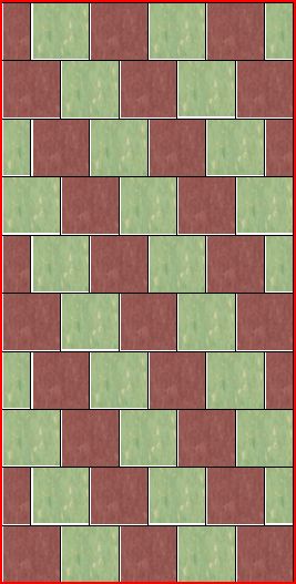
So today I went a little crazy. I visited the Azrock website and downloaded nearly every shade of green they have plus a few neutrals so I could play with patterns.  I then made my own template to try out the colors and patterns.  Lacking any real design software, I merely made a table in Word and then filled in the cells with the Azrock samples.  I even made sure that every other tile was turned 90 degrees, which is how VCT is commonly installed.  Here's what I came up with:

#1. I've more or less settled on the green (Azrock Rygrass) and I'm quite fond of the neutral (Azrock Salt and Pepper).  I'd much prefer to have a pattern to just a single color.  I also don't want a checkered floor.  There are so many other interesting patterns out there and if you look through old design books/catalogs, imaginative patterns in multiple colors were very popular in the 1950s and 60s.  Unfortunately, I'm a little hampered by my relatively small floor, so I can't get too wild with patterns because I simply don't have room for them.

#2.  This is a variation on the first one, obviously.

#3. I'm really enamored with the idea of using a dark red accent.  In looking at photos of homes from the 1960s, dark red or burgundies were a popular color.  It wasn't generally used in large doses but I like a touch of it here and there.  What I'd really like is a dark blue floor with burgundy accents but Azrock doesn't seem to make a super dark blue.


#4. For this one, I played around with the tile sizes to create a sort of check.

#5. This one may be too busy.

#6. This is what an all green would look like.  This is actually Azrock Mossy.

#7. One more with a lot more red.

I'm not enthralled by any of the options I've come up with.  I'm liking the red and green together a lot, especially in #3.  But the search continues.

I played around some more today, trying to copy some of the vintage patterns I've seen.

#8.  This one is sort of an interesting ripple effect.

#9.  Long diagonals.  This one at least packs a lot of pattern in a small package, which is what I need in such a small, narrow space.

I'm clearly leaning toward keeping the red in there.  I just wish it was a tad darker.


Saturday, January 26, 2013

Around Town - Commercial Mid Century Buildings

Commercial architecture isn't the most glamorous thing and old commercial architecture is viewed with a certain amount of distaste by some.  I, however, really enjoy it.  I like how commercial buildings can still reflect the design aesthetic of the time.  I went out this morning and got photos of some of my favorites.  I live in a small town, so the pickings are few but I like them.

This building actually has a pretty long history.  Underneath the 1950s paneling and wavy awning is a stone building constructed sometime around 1900.  It was the I.H. Kent Store for a long time.  I.H. Kent had a lumber yard and this general goods store.  Back in the 1910s, it was one of the few places you could buy gasoline - by the container, pumps wouldn't be common until the 1920s.  The store was damaged in 1954 during the Fairview earthquakes, so they covered up the damage with the pink enamel paneling and tiles.  Sadly it's vacant right now.

The architecture of this liquor store intrigues me.  I know of at least two other examples with the same shed roof and projecting beams - both of which are liquor stores in Reno.  It's on my list to do some research to figure out what the deal is with them.

Churchill County Library, mid 1960s.  The County wants to replace it with a larger, more modern library.  I like it just the way it is.

Ok, so technically the Fallon Theater isn't a mid century building.  It was constructed in about 1914 and the red "Fallon" sign was added in the 1930s.  It was the largest theater in Nevada when it was built and was such a big deal, people were bused in from Reno and Carson City on its opening night.  It's been for sale for a while (still operating, however).  It's my dream to form a non profit to buy it, fix it up, and run it as a both an art house theater and a first run movie theater.  I'm working up the courage to talk to the owner.  It was originally a Vaudeville theater - I'm wondering if there's still a stage.

This is the Churchill County Communications Building.  Truly only a mid century maniac like me would like it.  The cool thing about CC Communications is that it's the only county run phone company in the country.  It goes way, way back in Fallon's history.
 
Ok, so this one is neither mid century nor commercial but it's one of my favorite buildings - Hariom Apartments, an 8 plex.  I think it goes back to the 1930s.


I loves me an old motel.  I'm super glad the owners haven't tried to modernize the exterior of this one.
 
I'm not entirely sure this one is occupied.  I'd love to think of a business to run out of it.  Cute little masonry building with clerestory windows.